Watch Ads Always Show 10:10: The Real Reasons
The Time on Every Watch Ad
Most watches in ads show 10:10. Why? It is not random. The answer combines logo placement, psychology, dates, and a few brands that deliberately break the pattern. In watch advertising, the display time is part of the composition. It is a small detail that tells you where to look, how to feel, and sometimes which number is lucky.
From 8:20 to 10:10
In the 1920s and 1930s, watches advertised often showed 8:20. That time had a practical advantage: it allowed brand and logo space to be seen. The hands left the upper half of the dial open. But 8:20 also had a problem. Swatch spokesman Klaus Peter Mager explained in a 2008 New York Times interview that watches were photographed at 10:10 instead of at 8:20 because they’re smiling instead of a sad man’s face. That quote captures the shift. A watch set at 8:20 can look droopy. A watch set at 10:10 can look alert, open, almost cheerful.
Hamilton Watch Company began using 10:10 in ads as far back as 1926. Rolex used 10:10 in ads in the 1940s. By the 1950s, 10:10 was the common display time in watch ads. So the convention was not born on social media. It grew through print campaigns, product photography, and the needs of watch brands.
The Logo Has a Sweet Spot
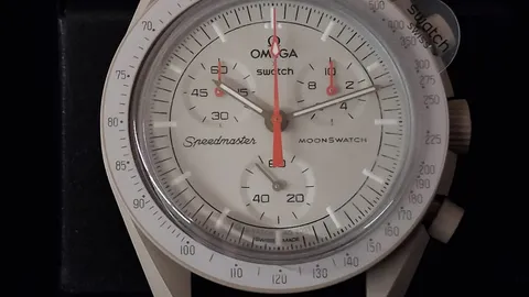
Brand names typically sit centered on the upper half of a watch. That position is not accidental. The hands at 10 and 2 frame the brand and logo. When the hands point to roughly 10 and 2, they create an open frame around the upper dial. The brand name is not covered. The hands do not overlap. The symmetry is appealing. This is the core visual argument for 10:10.
At 8:20, the hands also allow brand and logo space to be seen. But the composition is different. The hands pull the eye downward. The upper half feels emptier. At 10:10, the hands lift the eye and bracket the logo. The dial looks balanced rather than bottom-heavy. For a product that is often photographed as a small object in a large ad, that balance matters. The watch must read instantly. The logo must be legible. The face must feel welcoming. 10:10 does all three jobs at once.
The Smile Theory
The “smile” explanation is the one people remember. Mager’s 2008 statement turned a design convention into a human metaphor. At 10:10, the hands angle upward like a mouth turned up. At 8:20, they angle downward like a mouth turned down. That is not a technical specification, but it is an effective way to describe why one time feels better than another.
The smile theory also explains why 10:10 survived even as watch advertising moved from print to billboards to digital. A smiling face is easy to read at a glance. A sad face is not. Brands want the watch to look happy, confident, and open. They want the product to invite the viewer in. The time on the dial is part of that invitation.
What the 2017 Study Found
The smile theory is not the only explanation. A 2017 psychological study compared watches set at 10:10, 8:20, and 11:30. The finding was specific: watches set at 10:10 induced significantly stronger feelings of pleasure compared with the other time settings. The study also found a gender difference. Watches set at 10:10 induced in women significantly stronger ratings of pleasure than in men.
That does not mean every viewer consciously notices the time. Most people do not. But the study suggests that the arrangement of the hands can influence mood below the level of conscious analysis. A watch ad is not only selling a product. It is selling a feeling. If 10:10 makes the watch feel more pleasant, then 10:10 becomes a default.
Dates, Lucky Numbers, and Small Clues
The hands are not the only part of the dial that gets art-directed. Date windows are often set to a specific number. The number 28 is a common choice because it maximizes space in a date window and is visually pleasing. It also carries cultural weight. In Chinese culture, the number 8 is the luckiest number, associated with wealth and good fortune. The number 28 is considered lucky as well because it sounds like “double prosperity.” A date window showing 28 can therefore do two jobs: it fills the window neatly, and it carries a positive association.
Rolex has used this trick. A Rolex watch with day and calendar displayed Monday the 28th. Cartier has displayed the calendar date 08. Cartier ads have also shown times of 10:08, 10:09, and 10:10. The pattern is not perfectly rigid. Brands adjust by a minute or a date to suit the composition or the market.
When Brands Break the 10:10 Rule
Not every watch ad follows the convention. Timex has used the display time 10:09:36 in ads. It has also used 10:09:36 for digital watch ads. The second hand position at 36 allows branding or dials at the bottom of the watch to be seen. In 2022, a Timex billboard showed 10:17 with the second hand at 36. The goal is still visual clarity. The exact minute matters less than what the hands reveal or hide.
Parmigiani has a more personal approach. It has set time to 7:08, which was founder Michel Parmigiani’s time of birth. It has displayed the date 2 in honor of his birthdate, December 2nd. That is not about a smile or a logo. It is about identity. The watch face becomes a signature.
Apple has its own famous time story. The iPhone was previously set to 9:42 am, the time Steve Jobs introduced the iPhone at MacWorld in 2007. The display time changed to 9:41 after the first iPad was released in 2010. Scott Forstall, former iOS chief, explained that Apple keynotes are designed so the big reveal happens around 40 minutes into the presentation. Apple wants the time shown on the device to be close to the actual time on audience watches. Some Apple watches have shown 10:09. So even a company known for its own rules sometimes lands near the classic watch-ad time.
Why 10:10 Still Works
The 10:10 convention is a rare thing: a marketing habit with a visual logic, an emotional story, and a small body of research behind it. It began as a practical way to show the brand. It became a way to make the watch smile. It was reinforced by Hamilton, Rolex, and countless ads through the 1950s. It survived because it solves a real problem. A watch dial is crowded. The logo needs room. The hands need to look balanced. The product needs to feel good at a glance.
That is why the next time you see a watch ad, the time is probably 10:10. It is not telling you the time. It is telling you how to see the watch. The hands frame the name. The date window may show a lucky number. The smile may be subtle. But the choice is deliberate. In advertising, even the time on the dial is a message.
Think you know your watches? Test yourself in today’s challenge at Watchdle.